Last month, I found myself frozen in the paint aisle, staring at two seemingly identical white paint chips labeled “Alabaster.” One from Sherwin Williams, one from Benjamin Moore. That moment of retail paralysis sparked a deep dive into what might be the most sophisticated white paint showdown of our time. After testing both in various lighting conditions across multiple spaces, I’m ready to share everything you need to know to make the right choice for your home.
If you’ve ever researched “perfect white paint” (and based on search trends, thousands of you do every month), you’ve likely encountered Alabaster. This sophisticated neutral has achieved cult status in the design world. But here’s where it gets tricky – both Sherwin Williams and Benjamin Moore offer their own version of this coveted shade, and despite sharing a name, they’re distinctly different whites.
Understanding the Basics: What Makes These Whites Different
Before diving into specific applications, let’s establish the fundamental differences between these two popular whites:
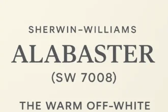
Sherwin Williams Alabaster (SW 7008)
- Undertones: Warm with subtle beige and gray undertones, giving it a creamy appearance without leaning too yellow
- Light Reflectance Value (LRV): 82 (reflects significant light while maintaining depth)
- Color Character: Soft, versatile white that reads as warm without becoming too creamy
- Named: Color of the Year by Sherwin Williams in the past
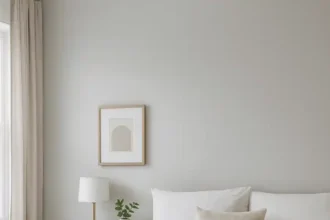
- Best For: Creating a cozy, inviting atmosphere in living rooms, bedrooms, and versatile enough for most spaces
When I painted my south-facing office with SW Alabaster, I witnessed its remarkable ability to shift throughout the day—warm and inviting in morning light, crisp and clean by afternoon, and softly luminous at sunset.
Benjamin Moore Alabaster (OC-129)
- Undertones: More varied—some spaces reveal subtle yellow undertones while others show a hint of pink
- Light Reflectance Value (LRV): 75.8 (absorbs more light, appearing deeper)
- Color Character: Slightly more saturated white with more pronounced undertones
- Works well: In spaces that need added warmth, particularly north-facing rooms
- Best For: Achieving a bright yet warm contemporary look, especially in north-facing spaces
In my dining room with primarily northern exposure, BM Alabaster brought exactly the warmth needed to counteract the cooler light, creating an inviting atmosphere for gatherings.
Side-by-Side Comparison: At a Glance
| Feature | Sherwin Williams Alabaster (SW 7008) | Benjamin Moore Alabaster (OC-129) |
| Undertones | Balanced warm with subtle beige/gray | More noticeable warmth (yellow/pink) |
| LRV | 82 | 75.8 |
| Best rooms for | Versatile—works in most spaces | North-facing rooms needing warmth |
| Works with | Traditional and contemporary styles | Both styles, but especially traditional |
| Pairs well with | Agreeable Gray, Sea Salt, Repose Gray | White Dove, Pale Oak, Classic Gray |
| Finish options | Flat, Matte, Eggshell, Satin, Semi-gloss | Flat, Matte, Eggshell, Pearl, Semi-gloss |
| Price point | $$-$$$ | $$$-$$$$ |
How Light Exposure Transforms These Whites
The direction your windows face dramatically impacts how these whites will appear in your space:
North-facing rooms
- BM Alabaster truly shines here, as its warmth beautifully counterbalances the cool northern light
- SW Alabaster can sometimes appear slightly flat or grayed in strictly north-facing spaces
South-facing rooms
- SW Alabaster maintains its balanced white quality without becoming too yellow
- BM Alabaster might intensify in warmth, sometimes reading more cream than white
East/West-facing rooms
- Both perform well but transform dramatically from morning to evening
- SW Alabaster shows less dramatic shifting between warm and cool
- BM Alabaster embraces the changing light, appearing notably different at dawn versus dusk
Pro tip from my design experience: Always test paint samples on multiple walls of your space and observe them throughout the day before committing. The $10 spent on samples can save hundreds in repainting costs.
Real-World Applications: Where Each Alabaster Truly Shines
On Walls
SW Alabaster walls create a light, airy feel without the harshness of pure white. In my open-concept living area, it beautifully unifies different functional zones while keeping the space feeling expansive and cohesive. It’s particularly stunning against wood tones—making both medium oak floors and darker walnut furniture pieces stand out beautifully.
BM Alabaster walls bring slightly more richness and depth. For a recent client project, we paired BM Alabaster walls with crisp white trim (Benjamin Moore’s Chantilly Lace) for subtle contrast that defined the architectural details without feeling stark. The warmer undertone makes it especially complementary to brass fixtures and warm-toned artwork.
On Cabinetry
SW Alabaster cabinets strike that perfect balance of warm and clean. They don’t read as “BRIGHT WHITE KITCHEN” but instead offer a sophisticated, slightly softened look. I recently selected SW Alabaster for kitchen cabinetry paired with Carrara marble countertops—the subtle warm undertone beautifully complemented the cool veining in the marble.
BM Alabaster cabinets deliver a creamier look that works wonderfully in traditional spaces or homes with vintage character. The deeper quality makes fingerprints and smudges less obvious (a practical consideration for busy households). They pair exceptionally well with warmer countertop materials like butcher block or beige-toned quartz.
On Trim and Doors
SW Alabaster trim provides a soft alternative to stark white trim. It’s especially effective when you want a low-contrast look between walls and trim, creating a seamless, sophisticated envelope. I’ve used it on all my interior doors for a consistent, clean appearance that doesn’t call attention to itself.
BM Alabaster trim brings more noticeable warmth. This makes it excellent for older homes with character, where brilliantly white trim might look jarringly modern. The increased depth also helps camouflage inevitable scuffs and marks that plague baseboards and door frames.
Paint Quality Comparison: Benjamin Moore vs Sherwin Williams
One question I’m frequently asked: Which brand offers better quality paint? The honest answer is more nuanced than a simple declaration of superiority.
Benjamin Moore Strengths
- Superior coverage (often achieving one-coat coverage where competitors need two)
- Rich pigments and exceptional color consistency between batches
- Smooth application with premium lines creating remarkable depth
- Excellent durability particularly in their Regal Select and Aura lines
Sherwin Williams Strengths
- Excellent washability and durability, especially in premium lines
- Wide availability with frequent 30-40% off sales events
- Consistent performance across various sheens
- Strong stain resistance in higher-end formulations
Both manufacturers offer excellent quality across various price points:
Sherwin Williams offers Alabaster in multiple lines:
- Duration (excellent washability for high-traffic areas)
- Emerald (premium offering with superior durability)
- Cashmere (creates a luxurious, smooth finish ideal for bedrooms)
- ProClassic (perfect for trim and cabinetry with self-leveling properties)
Benjamin Moore carries Alabaster in:
- Aura (top-tier option with remarkable coverage and depth)
- Regal Select (excellent durability with beautiful finish)
- ben (more affordable line with respectable performance)
- ADVANCE (waterborne alkyd formula ideal for cabinetry and trim)
According to professional painters I’ve consulted, Benjamin Moore often has a slight edge in coverage and color richness, while Sherwin Williams excels in durability and stain resistance. For most homeowners, either brand will provide excellent results when properly applied.
Finding Alternatives: Similar Colors Worth Considering
If You Like SW Alabaster, Consider These Alternatives:
Within Sherwin Williams:
- Greek Villa (SW 7551) – Slightly warmer
- Pure White (SW 7005) – A touch brighter and less warm
- Snowbound (SW 7004) – Similar lightness but with subtle gray undertones
- Shoji White (SW 7042) – More greige, but with similar softness
From Benjamin Moore:
- White Dove (OC-17) – Slightly creamier but with similar versatility
- Cloud White (OC-130) – A touch brighter with similar warmth
- Swiss Coffee (OC-45) – Warmer and deeper
If You Like BM Alabaster, Consider These Alternatives:
Within Benjamin Moore:
- White Dove (OC-17) – Less yellow, more balanced warmth
- Swiss Coffee (OC-45) – Similar depth with different undertones
- Dune White (968) – Neutral off-white with subtle warm undertones
From Sherwin Williams:
- Creamy (SW 7012) – Similar depth and warmth
- Divine White (SW 6105) – Warmer with more beige undertones
- Alabaster (SW 7008) – Slightly lighter, less yellow
Finding Cross-Brand Equivalents
If you’re committed to one brand but trying to match the other’s Alabaster as closely as possible:
For Matching SW Alabaster with Benjamin Moore:
- White Dove (OC-17) – Widely considered the closest BM equivalent to SW Alabaster
- Cloud White (OC-130) – Another close match with similar warmth
- Oxford White (CC-30) – Less warm but with similar lightness
For Matching BM Alabaster with Sherwin Williams:
- Creamy (SW 7012) – Similar depth and warmth profile
- Greek Villa (SW 7551) – Comparable warmth but slightly different undertone balance
- Divine White (SW 6105) – Similar depth with slightly different undertone mix
Important note: You won’t find identical matches between brands. Each company uses proprietary colorants and bases, making perfect matches impossible. If you’re trying to match existing SW Alabaster walls with BM trim paint (or vice versa), your best bet is to have one brand custom-match the other’s color.
Personal Experience: A Tale of Two Whites
In my own home renovation journey, I faced the classic dilemma: SW Alabaster or BM Alabaster? I painted large sample swatches of both in my north-facing living room with vintage decor elements. The results were revealing:
Sherwin Williams Alabaster exuded a warm, cozy vibe that felt sophisticated without being too yellow. It complemented my vintage furnishings beautifully while still feeling current.
Benjamin Moore Alabaster appeared slightly deeper and brought out the warmth in the space—almost too much in certain lighting conditions, occasionally reading with a subtle pinkish cast against my particular furnishings.
In the end, I chose SW Alabaster for its versatility and balanced warmth. However, a designer friend of mine swears by BM Alabaster for her historic home renovations, praising its richer quality and how it beautifully complements antique woods.
My Alabaster Mistake: A Cautionary Tale
Let me share a cautionary tale from my design experience. When renovating our main bathroom, I confidently selected BM Alabaster for the walls, having used it successfully in other spaces. The bathroom had a small north-facing window, and I reasoned that the warmth of BM Alabaster would counteract the cool light.
What I didn’t account for was how the greenish cast from abundant outdoor foliage would interact with the paint’s undertones. The resulting color looked noticeably yellow-green in certain lighting—not the serene spa-like atmosphere I’d envisioned!
After living with it for just three days, I repainted with SW Alabaster, which proved much more adaptable to the shifting greenish light. The more balanced undertones maintained a clean look regardless of time of day or season. It was a $75 mistake that taught me that even subtle undertone differences matter tremendously in real-world applications.
Making Your Final Decision: A Practical Guide

Still torn between these two beautiful whites? Here’s my practical decision framework:
- Always get samples. Theory helps, but nothing replaces seeing the actual color in your actual space. Paint large swatches (at least 12″×12″) on multiple walls and observe them throughout the day.
- Consider existing elements. Your flooring, countertops, and key furniture pieces should inform your white selection. BM Alabaster typically works better with warm-toned elements, while SW Alabaster offers slightly more versatility across warm and cool counterparts.
- Think about the feeling you want. BM Alabaster creates a slightly cozier, more enveloping feel, while SW Alabaster leans toward bright and fresh without becoming clinical.
- Factor in practicality. Consider store locations, availability, and future touch-up needs when selecting your brand.
- Analyze your lighting. North-facing rooms generally benefit from the warmth of BM Alabaster, while SW Alabaster offers more flexibility across different light exposures.
Remember, there’s no objectively “better” choice—only the right choice for your specific space, lighting, and design preferences.
Expert Recommendation: Which Alabaster Wins?
After using both colors in numerous spaces and client projects, my professional assessment is that Sherwin Williams Alabaster offers slightly greater versatility across different lighting conditions and design styles. Its more balanced undertone adapts beautifully to changing light throughout the day, and it pairs well with both warm and cool companion colors.
However, for spaces that need added warmth—particularly north-facing rooms or spaces with cool flooring like gray tile—Benjamin Moore Alabaster brings welcoming richness that can transform an otherwise chilly space.
Both are sophisticated, designer-approved whites that will serve you far better than basic builder white. Your specific lighting, existing elements, and color preferences should be your ultimate guide.
Final Thoughts: Beyond the Paint Color
While choosing between these two beautiful whites is important, remember that proper preparation and application are equally crucial for beautiful results. According to painting professionals from both Sherwin Williams and Benjamin Moore, the key to a flawless finish lies in:
- Proper surface preparation
- Quality tools appropriate for your surface
- Application technique suited to your specific paint formulation
- Appropriate number of coats (always follow manufacturer recommendations)
For more detailed information on each specific color, be sure to check out our in-depth guides to Benjamin Moore Alabaster and Sherwin Williams Alabaster. And always consider consulting with a professional painter or designer for particularly challenging spaces.
Have you used either Alabaster shade in your home? I’d love to hear about your experience in the comments below.
Happy painting—may your corners be crisp and your coverage complete!