Color theory isn’t just for artists—it’s the secret to creating stunning, balanced, and inviting spaces in your home. By understanding the color wheel and how colors interact, you can design rooms that feel serene, vibrant, or cozy, depending on your style and needs.
In this guide, you’ll learn how to use color theory to choose harmonious palettes, discover the best color schemes for every room, and understand the impact of lighting and textures on your design. Plus, you’ll get actionable tips and tools to help you experiment with confidence.
Let’s get started!
What is Color Theory?
Color theory is a guide that explains how colors interact and work together to create harmony, contrast, or balance. It’s a fundamental concept in interior design that helps you pick the perfect color combinations to set the mood, reflect your style, and enhance the beauty of your home.
Whether you’re painting walls, selecting furniture, or choosing decor, understanding color theory will give you the confidence to make decisions that transform your space into something cohesive and inviting.
The Basics of Color Theory
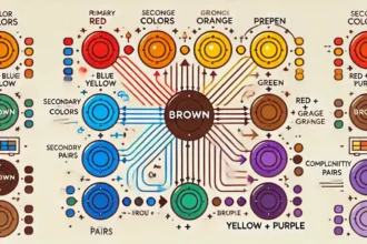
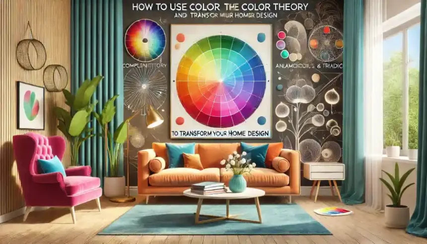
1. The Color Wheel
The color wheel is a simple yet powerful tool that organizes colors to show their relationships. It’s divided into:
- Primary Colors: Red, blue, and yellow—these are the foundation for all other colors.
- Secondary Colors: Green, orange, and purple—created by mixing two primary colors.
- Tertiary Colors: Shades like blue-green or red-orange—made by mixing a primary and secondary color. For example, if you’re wondering how to create neutral shades like brown, check out this guide on What Colors Make Brown.
2. Types of Color Relationships
The color wheel reveals how colors work together to create different effects:
- Complementary Colors: Opposite colors, like blue and orange, create bold, high-contrast looks.
- Analogous Colors: Neighboring colors, such as green, blue-green, and blue, produce soft and harmonious designs.
- Triadic Colors: Three evenly spaced colors, like red, blue, and yellow, offer a vibrant and balanced palette.
3. Warm vs. Cool Colors
Colors can be divided into warm and cool tones, each evoking different feelings:
- Warm Colors: Red, orange, and yellow create energy, warmth, and coziness.
- Cool Colors: Blue, green, and purple feel calming, refreshing, and open.
Why Color Theory Matters in Interior Design
Understanding color theory is key to creating a home that’s both beautiful and functional:
- Complementary Colors: Use them for bold contrast, ideal for accent walls or statement furniture.
- Analogous Colors: Choose these for soothing and cohesive spaces like bedrooms or living rooms.
- Warm Colors: Make larger areas feel cozier and more inviting.
- Cool Colors: Expand smaller spaces, making them feel more open and relaxing.
By mastering these principles, you can confidently choose colors that reflect your personality, set the mood, and ensure your home feels harmonious.

Understanding the Color Wheel
The color wheel is a key design tool that helps you select colors that look great together. It visually organizes colors and makes it easier to create harmonious, balanced, or bold palettes based on your style and the mood you want for your home.
The Basics of the Color Wheel
1. Primary Colors
Red, blue, and yellow form the foundation of the color wheel. These colors cannot be created by mixing others, but they combine to produce all other hues.
2. Secondary Colors
Mixing two primary colors creates secondary colors:
- Red + Yellow = Orange
- Blue + Yellow = Green
- Red + Blue = Purple
3. Tertiary Colors
When you mix a primary color with a neighboring secondary color, you get tertiary colors like red-orange, blue-green, and yellow-green. These shades add depth and variety to your palette.
How the Color Wheel Guides Interior Design
The color wheel can help you craft color schemes that suit your space and mood. Here’s how:
Complementary Colors: These are colors opposite each other on the wheel, such as blue and orange or red and green. They create high-contrast, vibrant designs.
Example: A living room with blue walls and orange cushions creates a bold and dynamic look.
Analogous Colors: These are colors next to each other on the wheel, like yellow, yellow-green, and green. They create soft, harmonious designs.
Example: Using shades of green and blue in a bedroom can evoke a calming and restful atmosphere.
Triadic Colors: These are three evenly spaced colors, such as red, blue, and yellow. They provide a lively yet balanced palette.
Example: Add red accents to a room with blue walls and yellow furniture for a playful, energetic vibe.
How to Use the Color Wheel in Your Home Design
- Choose a Base Color: Start with a dominant color for large elements like walls, sofas, or cabinets.
- Add Supporting Colors: Use complementary, analogous, or triadic colors for accents like cushions, curtains, or rugs.
- Experiment Before Committing: Test your palette with paint swatches or digital tools to see how the colors look together in your space.
Key Takeaway: The color wheel is a must-have tool for designing beautiful and balanced spaces. By understanding primary, secondary, and tertiary colors—and learning to use complementary, analogous, and triadic schemes—you can confidently create rooms that reflect your style and personality.
The Psychology of Colors in Interior Design
Color isn’t just about aesthetics—it has a powerful effect on our emotions, behaviors, and how we experience a space. Understanding the psychology of colors can help you choose the perfect palette to create the mood you want in each room of your home. Whether you’re designing a calm retreat or an energetic workspace, the right colors make all the difference.
How Colors Affect Mood and Perception
- Blue: Calmness and Focus: Blue is a cool, soothing color that promotes relaxation and tranquility. It’s often associated with feelings of peace and focus, making it a popular choice for bedrooms, bathrooms, and home offices.
Example: Paint your bedroom walls a soft blue to encourage restful sleep, or add blue accents to your office for a productive vibe.
- Yellow: Energy and Warmth: Yellow is a bright, cheerful color that brings energy and warmth to a space. It stimulates creativity and can uplift your mood, making it ideal for kitchens, playrooms, or any area where you want a boost of positivity.
Example: Use yellow curtains or decor in your kitchen to create a lively, welcoming atmosphere that inspires activity and socializing.
- Green: Balance and Harmony: Green is a versatile color that represents nature, balance, and growth. It’s calming yet refreshing, making it perfect for living rooms, bedrooms, or any space where you want to feel grounded.
Example: Add green plants or use green tones on furniture to create a relaxing and harmonious living area.
- Red: Passion and Energy: Red is bold and stimulating, often evoking feelings of passion and excitement. It’s best used as an accent color to avoid overwhelming a space.
Example: Use red in dining rooms or as accent pillows in a living room to add energy and warmth without dominating the design.
- Neutral Colors: Versatility and Comfort: Neutral shades like beige, gray, and white create a calming and timeless backdrop. These colors pair well with bolder hues and help maintain balance in a room.
Example: Use a neutral wall color and add pops of bold colors through decor for a sophisticated yet dynamic look.
Using Color Psychology in Home Design
- Match Colors to Function: Think about how you want to feel in a room:
- Relaxed: Use cool colors like blue or green.
- Energized: Choose warm colors like yellow or red.
- Combine Colors Strategically: Mix colors with different emotional impacts to balance a space. For example, pair a vibrant yellow accent wall with neutral furnishings to create energy without overwhelming the room.
- Test Colors in Your Space: Lighting can change how colors look. Test paint samples or fabric swatches to ensure the colors work as intended in your home.
Key Takeaway: Colors don’t just transform how your home looks—they influence how it feels. By understanding the psychology of colors, you can design spaces that support your lifestyle, whether you need calmness, energy, or balance. Use blue for serenity, yellow for vibrancy, and green for harmony, and combine them thoughtfully to create a home that feels perfect for you.
Popular Color Schemes for Home Design
Choosing the right color scheme is essential for creating a cohesive and visually appealing space. The right palette can make a room feel harmonious, vibrant, or soothing. Here are four popular color schemes, with practical tips and examples to inspire your home design.
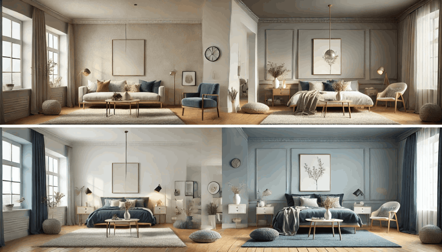
Monochromatic Color Scheme
A monochromatic scheme uses varying shades, tints, and tones of a single color to create a minimalist, cohesive look. This approach is perfect for spaces where simplicity and elegance are key.
- Example: In a living room, opt for soft gray walls, charcoal furniture, and silver accents to achieve a modern, calming vibe.
- Additional Idea: For a bedroom, try a range of blues—from light sky blue walls to navy bedding—for a tranquil and serene space.
- Best For: Bedrooms, bathrooms, and any room where relaxation is the goal.
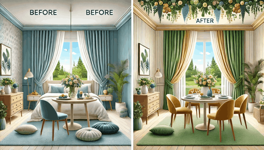
Analogous Color Scheme
This scheme combines three colors that sit next to each other on the color wheel, offering harmony and subtle variation. Analogous schemes are inspired by nature, making them a great choice for creating a natural, serene flow.
- Example: In a bedroom, pair blue walls, blue-green cushions, and green curtains for a cohesive, refreshing vibe.
- Additional Idea: Use shades of green, yellow-green, and yellow in a dining room to create a lively yet sophisticated ambiance.
- Best For: Living rooms, bedrooms, and dining areas where a calm yet vibrant atmosphere is desired.
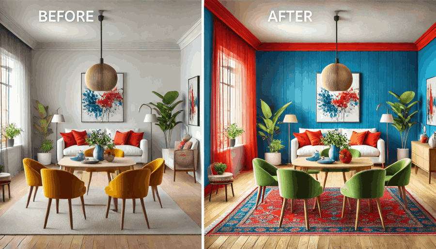
Complementary Color Scheme
Complementary colors are opposite each other on the color wheel, creating bold contrast and energy. This high-impact scheme works well for spaces where you want to grab attention or make a statement.
- Example: Pair blue walls with orange accent pillows in a living room to create a dynamic and bold look.
- Additional Idea: In a dining room, use a red accent wall paired with green chairs for a striking yet balanced design.
- Best For: Dining rooms, playrooms, and living rooms where energy and vibrancy are key.
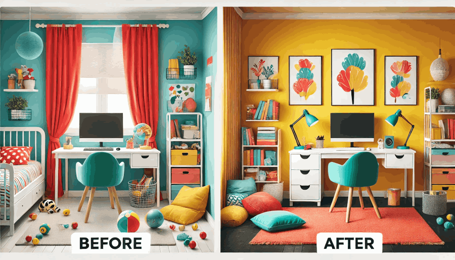
Triadic Color Scheme
This scheme uses three evenly spaced colors on the wheel, creating a vibrant, balanced look. Triadic schemes are playful and work well in creative spaces.
- Example: Use red curtains, yellow cushions, and a blue rug in a kids’ room for a bright, energetic design.
- Additional Idea: In a home office, combine mustard yellow walls, a teal chair, and pops of coral in accessories to inspire creativity and focus.
- Best For: Playrooms, home offices, and areas where energy and balance are needed.
By understanding and applying these color schemes, you can create rooms that not only look stunning but also match your desired mood and style. Whether you prefer the simplicity of a monochromatic look or the bold energy of complementary colors, there’s a scheme for every space in your home.
Room-by-Room Color Application
Choosing the right colors for each room in your home is key to setting the perfect mood and making your spaces functional and beautiful. Here’s a guide to the best color ideas for every room, with easy-to-follow examples and tips.
Living Room: Warm Tones for Comfort
Warm colors like beige, rust, and terracotta make your living room feel cozy and inviting—perfect for relaxing or entertaining guests.
- Example: Pair a soft tan sofa with rust-colored cushions and a cream rug to create a welcoming space for family gatherings.
- Quick Tip: Add texture with a chunky knit throw or a woven basket for extra warmth and style.
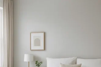
Bedroom: Cool and Neutral Colors for Relaxation
Cool tones like blue, green, and gray help create a calm and peaceful atmosphere for better rest and relaxation.
- Example: Paint your walls a light blue, use gray bedding, and add white curtains for a soothing, serene look.
- Quick Tip: Use blackout curtains and dimmable lighting to enhance the cozy, restful vibe.
Kitchen: Bright, Vibrant Colors for Energy
The kitchen is the heart of your home, and bright colors like yellow, orange, and lime green can bring energy and cheer to this busy space.
- Example: Add yellow tiles for a backsplash, pair them with white cabinets, and include some greenery for a lively, fresh kitchen.
- Quick Tip: If you prefer a neutral base, use bold colors in accents like bar stools, rugs, or tea towels for a pop of vibrancy.
Bathroom: Soft Hues for a Spa-Like Feel
Soft colors like aqua, lavender, or light gray transform your bathroom into a relaxing, spa-inspired retreat.
- Example: Paint the walls light gray, accessorize with aqua towels, and use bamboo accents to create a serene atmosphere.
- Quick Tip: Add candles or soft lighting to make the space feel even more tranquil.
FAQs: Common Room Color Questions
What are the best colors for small spaces?
Light neutrals like off-white, soft gray, or pale beige can make small rooms feel bigger and more open. For bold colors, use them in accents to avoid overwhelming the space.
How can I make a large room feel cozier?
Use warm tones like terracotta, rust, or deep brown to make a large room feel more intimate. Adding area rugs and darker furniture can also help anchor the space.
What colors work best for open floor plans?
Stick with a cohesive neutral palette like gray, beige, or white. Add pops of color through accents such as cushions, rugs, or artwork to create flow and keep the space interesting.
By choosing colors that suit the purpose and mood of each room, you can transform your home into a space that’s both functional and beautiful. Whether you want a cozy living room or a spa-like bathroom, the right colors will bring your vision to life.
Lighting and Its Effect on Colors
Lighting has a significant impact on how colors look in your home. The same shade can appear brighter, softer, warmer, or cooler depending on the type of light and the time of day. To make the right color choices, it’s essential to consider both natural and artificial lighting.
How Natural Light Affects Colors
- Morning Light: Cool and soft, morning light enhances lighter tones like pastels and makes them appear fresh and airy.
- Afternoon Light: Warm and intense, afternoon light brings out the richness in bold colors like deep reds and oranges.
- North-Facing Rooms: These rooms often feel cooler because they get less direct sunlight. Opt for warm tones like beige, soft yellow, or terracotta to balance the cooler light.
- South-Facing Rooms: Bathed in natural light all day, south-facing rooms can handle both warm and cool tones, allowing for flexibility in your color choices.
How Artificial Light Affects Colors
- Warm Light (Incandescent Bulbs): This type of lighting enhances warm colors like yellows and reds but can make blues and greens appear dull.
- Cool Light (LED Bulbs): Cool lighting emphasizes cool colors like blues and greens, making them appear crisp and vibrant. However, it can make warm tones feel muted.
- Neutral Light (Full-Spectrum Bulbs): Full-spectrum bulbs mimic natural light and provide the most accurate representation of colors, making them ideal for spaces where precise color perception is essential, such as kitchens or studios.
Tips for Choosing Colors Based on Lighting
Here’s a step-by-step guide to ensure your color choices work well in any lighting:
- Identify Natural Light Levels: Observe how much natural light your room receives and when. Morning and afternoon exposure can drastically change how colors look throughout the day.
- Test Paint Samples in Different Lighting:
- Apply paint swatches to your walls and observe them in natural light (morning and afternoon).
- Use artificial lighting at night to see how the colors change.
- Use Layered Lighting: Combine ambient (overhead), task (focused), and accent (decorative) lighting to control how colors appear. For example:
- Use task lighting under cabinets to brighten countertops in kitchens.
- Add dimmable ambient lighting to bedrooms for a softer, more restful glow.
- Consider Window Treatments: Sheer curtains can diffuse harsh light, while heavier drapes can block light to prevent colors from appearing washed out.
Lighting is one of the most important factors in how colors look in your home. By testing colors in different lighting conditions and planning for layered lighting, you can create a space that looks stunning no matter the time of day.
Bonus Tip: Use full-spectrum light bulbs in areas where color accuracy is critical, like art studios, kitchens, or makeup areas. This will help ensure the colors you choose remain true to their intended tone.
Using Patterns and Textures with Colors
Patterns and textures add depth and variety to your home design, elevating simple color schemes into something dynamic and sophisticated.
How Patterns Enhance Color
Patterns combine multiple colors, helping tie a room together.
- Example: Add patterned cushions with complementary colors to a neutral sofa for visual interest.
How Textures Add Depth
Textures add a tactile element that enriches your design.
- Example: Use a textured wall, like exposed brick or wood paneling, to add warmth and character to your space.
Tips for Using Patterns and Textures
- Balance bold patterns with solid colors to avoid overwhelming a room.
- Mix textures, like pairing a velvet chair with a wool rug, to create visual interest.
How to Choose the Right Colors for Your Home
Choosing the right colors can feel overwhelming, but following these simple steps will help you create a cohesive and stylish home design:
Step 1: Start with Inspiration
Look for design ideas in magazines, online mood boards, or tools like Pinterest. Focus on color palettes that resonate with your personal style and the mood you want to create in each room.
Pro Tip: Save inspirational photos or create a digital vision board to visualize how the colors work together.
Step 2: Consider Your Space
Think about the room’s purpose, size, and lighting:
- Small Rooms: Use light, neutral colors like soft gray or beige to make the space feel larger and more open.
- Large Rooms: Add bold or dark colors, such as deep blue or forest green, to create a sense of coziness.
- Purpose of the Room:
- Use calming colors like blue or green for bedrooms and relaxation areas.
- Opt for energizing tones like yellow or orange for kitchens or playrooms.
Step 3: Use Paint Testers
Always test paint samples on your walls before committing. Observe how the colors look in your space under different lighting conditions throughout the day.
- Natural light can make colors appear brighter, while artificial lighting might soften or intensify tones.
- Paint small sections on multiple walls to see how shadows and angles affect the color.
Step 4: Use Digital Tools
Technology can make color selection easier. Apps and software allow you to visualize how different palettes will look in your space before you start painting.
- Sherwin-Williams’ ColorSnap Visualizer: Upload a photo of your room and experiment with thousands of paint colors.
- Benjamin Moore’s Color Portfolio App: Offers augmented reality (AR) tools to see how colors will appear in real time.
- Canva or Pinterest: Great for creating custom mood boards to explore different combinations of colors, textures, and patterns.
Step 5: Stick to the 60-30-10 Rule
This tried-and-true design rule ensures your room feels balanced and visually appealing:
- 60% of the room should feature a dominant color (e.g., walls or large furniture).
- 30% should showcase a secondary color (e.g., rugs, curtains, or smaller furniture).
- 10% should include an accent color to add pops of personality (e.g., throw pillows, artwork, or decor).
Key Takeaway: Choosing the right colors for your home doesn’t have to be intimidating. Start with inspiration, consider the purpose and lighting of each space, and use digital tools to visualize your palette. Test colors in your home, and stick to the 60-30-10 rule for a balanced and cohesive design. With these steps, you’ll create a home that reflects your style and feels uniquely yours.
Interactive Color Wheel Tool
Frequently Asked Questions About Color Theory in Home Design
Here are some of the most common questions about color theory in home design, along with actionable tips to guide your decisions:
What is the best color for small spaces?
Light and neutral colors like soft gray, beige, or off-white work best for small spaces because they reflect light and create the illusion of more space.
- Pro Tip: Add subtle pops of color through decor, like light blue cushions or a pastel wall accent, to make the room feel lively without overwhelming it.
How can I use complementary colors in my living room?
Complementary colors (opposite each other on the color wheel) like blue and orange or red and green can create a bold and balanced look.
- Example: Pair a navy-blue sofa with orange throw pillows, or add a red accent chair in a room with green walls to make the colors pop.
- Pro Tip: Use one color as the dominant tone and the complementary color as an accent to avoid visual clutter.
What are the best colors for a relaxing bedroom?
Cool, muted tones like soft blues, greens, or lavender create a calming atmosphere ideal for rest. Pair these with neutral accents like gray or beige for balance.
- Example: Light blue walls with gray bedding and white curtains can create a serene retreat.
How do I choose colors for an open-concept space?
In open-concept designs, stick to a cohesive palette by using analogous colors (next to each other on the color wheel) or neutral tones for a seamless flow between areas.
- Pro Tip: Use color accents like rugs or wall decor to subtly define different spaces, such as the living and dining areas.
How does lighting affect my color choices?
Lighting plays a critical role in how colors appear. Natural light makes colors look brighter, while artificial light can change their tone.
- Pro Tip: Test paint samples in various lighting conditions (daylight, evening, and artificial light) to ensure the colors work well in your space.
Conclusion
Color theory is the foundation of beautiful and balanced home design. By understanding how colors interact and using tools like the color wheel, you can create a space that reflects your style, sets the right mood, and feels uniquely yours.
Don’t be afraid to experiment! Start with small changes, like adding colorful decor or testing paint swatches, and see how colors can transform your home. Whether you’re creating a cozy living room, a calming bedroom, or an energizing kitchen, the right colors can make all the difference.
Ready to transform your space? Use our tips and tools to create the home of your dreams. Start experimenting today with our interactive color wheel!