The hunt for the perfect white paint ends here—discover why designers and homeowners alike can’t stop talking about this versatile neutral.
Standing in the paint aisle last summer, sweat beading on my forehead, I felt that familiar panic. You know the one—fifty nearly identical white paint chips in hand, each looking completely different once I got them home. The struggle was painfully real until I stumbled upon Benjamin Moore Alabaster (OC-129).
This wasn’t just another white paint swatch in the sea of similarity. This was the answer to my design indecision—the Goldilocks of whites that wasn’t too stark, too yellow, or too anything. Just right.
If you’re nodding along because you’ve been there (or you’re there right now), grab a coffee and settle in. Let’s talk about why Benjamin Moore Alabaster might be the hero your walls have been waiting for.
What Makes Benjamin Moore Alabaster Special?
Benjamin Moore Alabaster (OC-129) is what I’d call a “quiet achiever” in the white paint world. It’s not the brightest white in the collection, nor the warmest cream—it sits in that perfect middle zone where sophistication meets comfort.
Part of Benjamin Moore’s Off-White Collection, Alabaster offers a soft, understated white with just enough warmth to feel welcoming without veering into yellow territory. It’s the paint equivalent of a perfectly worn-in linen shirt—relaxed yet refined.
I first discovered BM Alabaster when renovating my north-facing office that always felt like working in a cave, regardless of how many lamps I added. The transformation wasn’t dramatic in that HGTV reveal way, but the space suddenly felt like somewhere I actually wanted to spend time. The walls glowed rather than glared.
The Warm vs. Cool Debate: Where Does Alabaster Stand?
Let’s settle this right away: Benjamin Moore Alabaster is definitely a warm white. But it’s warm in the way your favorite coffee shop is warm—inviting without being suffocating.
It has subtle creamy undertones that prevent that institutional, surgical feel that cooler whites can sometimes create. Yet it stops well short of looking yellow or beige in most lighting situations.
In my experience, Alabaster manages to thread the needle beautifully:
- In north-facing rooms (which get cooler, bluish light), it adds just enough warmth to counterbalance without looking dingy
- In south-facing spaces flooded with golden hour light, it doesn’t amplify the warmth into yellow territory
- In artificially lit spaces at night, it maintains its character rather than shifting dramatically
This adaptability is why it works across so many different homes and styles—from traditional to modern farmhouse to contemporary loft spaces.
The Numbers: Benjamin Moore Alabaster LRV
For the paint nerds among us (I’m raising my hand here), let’s talk Light Reflectance Value. Benjamin Moore Alabaster has an LRV of approximately 82-85, depending on which source you consult.
In practical terms, this means:
- It reflects a substantial amount of light back into the room
- It’s light enough to brighten dark spaces
- It’s not so reflective that it creates glare or feels stark
- It has enough depth to provide some visual interest on the wall
This moderate-high LRV is part of what makes Alabaster such a practical choice for a variety of spaces. I’ve used it in both my tiny, windowless powder room and my sun-drenched kitchen with equally pleasing results.
Benjamin Moore Alabaster in Real Homes
Looking at tiny paint chips never tells the whole story. Let me share how this color performs in actual living spaces:
Living Rooms
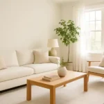
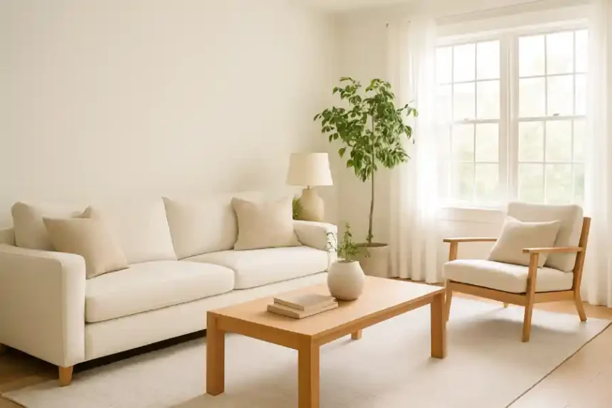
In my own living room, Benjamin Moore Alabaster creates a sophisticated backdrop that looks different throughout the day, but always in a good way. Morning light brings out subtle warmth, afternoon sun shows its creamier side, and evening lamp light makes it feel downright cozy.
The color provides enough interest to stand on its own but plays well with others—whether your style leans toward bold color accents or a more neutral palette. I’ve paired mine with navy blue accent chairs and natural wood tones, but it would work equally well with greens, terracottas, or grays.
Kitchens
For kitchens, Alabaster hits that sweet spot between crisp cleanliness and welcoming warmth. My neighbor painted her kitchen cabinets in BM Alabaster after years with stark white cabinetry, and the difference is subtle but significant. The space feels more intentional and less builder-grade basic.
It pairs beautifully with both cool-toned countertops like marble and warmer surfaces like butcher block. The subtle creaminess also makes it a great companion for brass or bronze hardware without creating a jarring contrast.
Bedrooms
In bedrooms, Benjamin Moore Alabaster creates a serene envelope that feels cozier than starker whites but still maintains an airy quality. A friend recently used it in her master bedroom with dusty blue linens and natural jute accents—the combination is magazine-worthy without trying too hard.
Benjamin Moore Alabaster vs. Other Popular Whites

With so many whites on the market, how does Alabaster compare? Here’s a practical rundown:
| Paint Color | Undertones | LRV | When It Works Best |
| Benjamin Moore Alabaster | Soft creamy | 82-85 | Versatile spaces needing warmth without yellow |
| Benjamin Moore White Dove | Soft gray-beige | 85.4 | Traditional homes, trim work |
| Benjamin Moore Simply White | Slight yellow | 91.7 | Bright, modern spaces needing warmth |
| Benjamin Moore Chantilly Lace | None (true white) | 92.2 | Modern, crisp, cool-toned spaces |
| Sherwin Williams Alabaster | Yellow-beige | 82.6 | Warmer spaces, more obvious cream |
When I was finalizing my whole-house color scheme, I painted large boards with Alabaster and several other contenders, then carried them from room to room throughout the day. What became clear was that Alabaster had the most consistent appearance as light changed—a crucial quality if you’re using it throughout your home.
How Light Exposure Affects Benjamin Moore Alabaster

The direction your windows face dramatically impacts how any paint color performs. Here’s my firsthand experience with how Alabaster behaves in different light exposures:
North-Facing Rooms
In spaces with northern exposure (which get cooler, bluish light), Alabaster’s warm undertones help balance the coolness without overcompensating. It won’t completely counteract very dim north light, but it performs better than starker whites that can look dingy or gray in these conditions.
My home office faces north, and Alabaster manages to feel bright without that cold, clinical feeling that pure whites often create in north-facing spaces.
South-Facing Rooms
Southern exposure brings warm, golden light that can intensify warm undertones in paint. Alabaster maintains its balance reasonably well in south-facing rooms, though it will appear noticeably warmer and creamier throughout the day.
In my south-facing living room, Alabaster takes on an almost luminous quality in late afternoon—not yellow, but definitely embracing its warm side. If you have a very bright southern exposure and want something completely neutral, you might find Alabaster pulls too warm.
East and West-Facing Rooms
These spaces experience the most dramatic light changes throughout the day. East rooms get bright morning light and cooler afternoon light, while west rooms are cooler in the morning and bathed in warm golden light in the evening.
I’ve found Alabaster adapts beautifully to these changing conditions. In my west-facing guest room, it looks almost bright white in the morning but takes on a warm glow as sunset approaches—like the walls are fitted with a built-in Instagram filter.
Styling Tips: Making Benjamin Moore Alabaster Shine

Once you’ve committed to Alabaster on your walls, how do you style around it? Here are some approaches that work particularly well:
For a Modern, Casual Look:
- Add black metal accents and natural woods for contrast
- Incorporate lots of textural elements—linen, jute, handmade ceramics
- Keep the palette neutral with strategic pops of muted color
- Bring in plenty of greenery to play off the warm walls
For a More Traditional Approach:
- Pair with rich wood tones like walnut or mahogany
- Add brass or bronze fixtures and hardware
- Incorporate classic patterns in upholstery and rugs
- Consider Alabaster for trim with a slightly deeper neutral on walls
For a Contemporary Edge:
- Create high contrast with charcoal or navy accents
- Add sleek, minimal furniture in neutral tones
- Incorporate concrete, glass, and metal elements
- Use strategic pops of bold color in art or accessories
In my own Alabaster-painted spaces, I’ve gone for what I’d call “casual modern”—a mix of mid-century shapes, natural textures, and some vintage pieces thrown in for character. The neutral backdrop of Alabaster makes this eclectic approach feel cohesive rather than chaotic.
Common Questions About Benjamin Moore Alabaster
After helping several friends choose this color for their homes, here are the questions I hear most often:
Does Benjamin Moore Alabaster look yellow?
This is probably the number one concern with warm whites. In most lighting situations, Alabaster doesn’t read as obviously yellow—it’s more of a soft, creamy white. However, in rooms with very warm light (south or west-facing) or spaces with lots of incandescent lighting, it can pull more of its warm undertones.
The best way to determine how it will look in your space is to paint a large sample board (at least 2′ x 2′) and observe it throughout the day. What I’ve found is that even when Alabaster shows its warm side, it’s a sophisticated warmth rather than a jaundiced yellow.
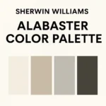
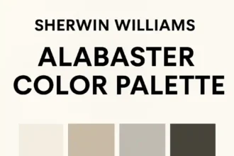
How does Benjamin Moore Alabaster compare to Sherwin Williams Alabaster?
Despite sharing a name, these are distinct colors:
- Benjamin Moore’s version has slightly less yellow undertone
- Sherwin Williams Alabaster reads warmer and more obviously creamy
- Both have similar LRVs around 82
- Benjamin Moore Alabaster tends to look more consistently white across different lighting conditions
I’ve used both in different projects, and while they’re certainly in the same family, the Benjamin Moore version tends to be more versatile and less prone to pulling too warm.
Can I use Benjamin Moore Alabaster on trim?
Absolutely! Alabaster makes a beautiful trim color, particularly if you’re going for a softer look than stark white trim provides. It works especially well if:
- You have warm-toned hardwood floors
- Your furnishings lean traditional
- You want a cohesive, tonal look
- You’re painting walls in a deeper color for contrast
For best results on trim, I recommend Benjamin Moore’s Advance line in a semi-gloss finish. The paint flows beautifully and creates a durable surface that stands up to cleaning.
Best Finishes for Benjamin Moore Alabaster
The finish you choose significantly impacts the final look:
- Flat/Matte: Creates a soft, velvety appearance that hides wall imperfections well. Best for bedrooms and low-traffic areas.
- Eggshell: My go-to for living spaces. Offers subtle sheen that enhances Alabaster’s depth while still being forgiving on walls.
- Pearl/Satin: Good for kitchens and bathrooms where more durability is needed. Makes Alabaster appear slightly brighter and more reflective.
- Semi-Gloss: Ideal for trim, doors, and cabinets. Creates more contrast between walls and trim, even when using the same color.
In my home, I’ve used eggshell finish for most walls, flat for ceilings, and semi-gloss for trim—all in Alabaster. The different sheens create subtle dimension without requiring different colors.
The Real-Life Test: Living with Benjamin Moore Alabaster

The true test of any paint color is how it feels to live with day after day. After nearly two years with Alabaster in multiple rooms of my home, here’s my honest assessment:
What I Love About It:
- It feels fresh but not stark
- It changes subtly throughout the day, creating visual interest
- It works with both cool and warm accent colors
- It makes my small spaces feel larger without feeling cold
- It makes an excellent backdrop for art and decor
Things to Consider:
- In very dim lighting, it can lose some of its character
- In extremely bright south-facing light, it does show its warm undertones
- Like all whites, it will look different in your space than it does in photos online
For me, the versatility of Alabaster has been its greatest strength. As my style has evolved and I’ve changed furniture and accessories, the walls have adapted beautifully to each new look.
Conclusion: Is Benjamin Moore Alabaster Right for Your Home?
After living with and recommending Benjamin Moore Alabaster countless times, I believe it’s one of the most versatile, livable whites available. Its balanced warmth makes spaces feel welcoming without skewing too yellow, while its light-reflective qualities help rooms feel bright and airy.
If you’re on the fence, here’s my advice: get a sample pot and paint a large board. Move it around different areas of your home at different times of day. Pay attention to how it looks when you most frequently use each space—morning light for breakfast nooks, evening light for living rooms, etc.
For those paralyzed by paint decisions (we’ve all been there), Alabaster offers something rare: a sophisticated neutral that works across different lighting conditions and complementary colors. Whether you’re refreshing a single room or creating a whole-house color scheme, it’s a choice that provides the perfect backdrop for living well.
Ready to transform your space with this designer-approved shade? Head to your local Benjamin Moore retailer to pick up a sample, and don’t forget to check out our guides on the best light gray paint colors for walls and Sherwin Williams Alabaster for even more inspiration.
I’d love to hear about your experience with Benjamin Moore Alabaster in the comments below. Has it worked its magic in your home too?