Sherwin Williams Alabaster (SW 7008) has become the go-to creamy off-white for modern interiors. Think of it as a warm cashmere sweater for your walls – softer and cozier than a stark white, but still bright and sophisticated. In fact, Sherwin-Williams calls it a “balanced white” that delivers “refreshing serenity and sleek modernity.” I remember painting my own living room in Alabaster and feeling how it quietly warmed the space without shouting, “White wall!” At first glance it simply looks clean and crisp; look closer and you notice its subtle beige/greige undertone that keeps it from feeling cold or sterile.
Sherwin-Williams even picked Alabaster as the 2016 Color of the Year, praising its ability to offer “personal solace and revival” in an overstimulated world. No wonder designers and homeowners alike rely on this versatile neutral. Below, we’ll unpack exactly what color Alabaster is, why it doesn’t actually look yellow in real rooms, how it behaves in different light, and where to use it for the most pleasing effect (with a few styling tips thrown in).

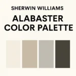
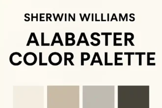
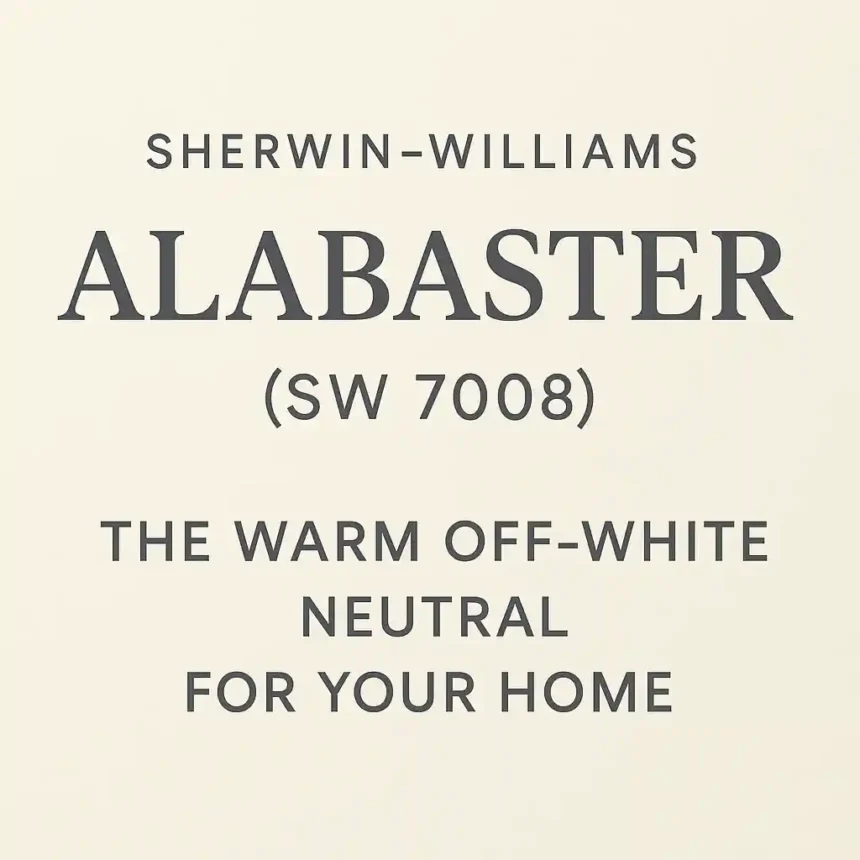
Swatch of Sherwin-Williams Alabaster SW 7008 (source: Sherwin-Williams via color curator). Note its creamy, off-white hue – warm enough to feel cozy, yet bright enough to feel fresh.
What Color Is Sherwin Williams Alabaster (SW 7008)?
At its core, Alabaster by Sherwin-Williams (SW 7008) is an off-white – but that phrase hides its nuance. Unlike stark whites, Alabaster carries a whisper of warmth. It has a greige (gray + beige) undertone that makes it feel creamy without leaning on pink or yellow. In practical terms, when you look at Alabaster on a wall, you’ll see a soft, warm white that reads clean and crisp but never cold. One designer sums it up well:
“Alabaster doesn’t lean strongly towards any one color… it has a gray-beige undertone – also known as a ‘greige’ undertone.”
In a bright room, this neutral baseline can look almost pure white. For example, in a north-facing space with lots of natural light, Alabaster will read nearly true-white. But even when the light dims, it never turns overtly yellow or pink – it just becomes a softer white.
- Soft Warmth: Officially, Sherwin-Williams calls Alabaster a balanced white, meaning it isn’t a cold blue-white or a cream-yellow white, but sits in a warm-neutral sweet spot.
- Light Reflectance: With an LRV (Light Reflectance Value) of 82, Alabaster reflects a lot of light, so it really brightens a room without feeling glaring. (By comparison, absolute white is 100 and most “true whites” are in the high 80s.)
Warmth & Undertones: Does Alabaster Look Yellow?
A common question is whether Alabaster looks yellow on walls. The answer is nuanced: Alabaster itself doesn’t “look yellow”; it simply has gentle warm undertones. If you hold it next to a cool bright white (like Sherwin’s “Extra White” or Benjamin Moore’s “Chantilly Lace”), then by comparison Alabaster’s warm glow will make it appear slightly creamier or even a touch beige. But in real rooms, it just reads as a soft white. One blogger puts it bluntly: “No! Alabaster does not read yellow at all. What your eye sees is a soft, creamy white with a bit of warmth, so it isn’t stark white or clinical.”. In practice, Alabaster warms up a space without ever looking like a yellow paint.
The key is context: under warm incandescent light or alongside very crisp whites, Alabaster’s warmth becomes noticeable. It’s not as yellow as shades like Creamy White, for example, nor does it have any green or pink bias. Instead, it’s like a whisper of vanilla in your latte – just enough to feel cozy. In my home, I once joked that Alabaster walls always seem ready for a latte break, but they never actually absorb a drop of spilled coffee!
To summarize:
- Undertones: Both warm (beige) and a hint of cool (soft gray) live in Alabaster, making it perfectly balanced.
- Yellow or Not?: By itself on walls, Alabaster looks like a clean, creamy white. In fact, designers agree it does not look yellow – even when paired with yellow-heavy whites, it just reads as gently warm.
- Relative Warmth: It’s slightly warmer than a “pure” white: next to Sherwin’s Pure White or Extra White (cooler blues), Alabaster will seem a bit buttery. But many prefer that touch of warmth, especially with beige or wood accents.
Lighting Matters: How Alabaster Changes in Different Light
One of Alabaster’s strengths is its chameleon-like response to light. In bright natural light, especially from the north, it can look almost like a true white. The creamy beige softens and nearly disappears in the glow, so the room feels open and airy. By contrast, under warm indoor light (warm LEDs or incandescent bulbs), those beige undertones become more obvious, making the room feel cozier.

Example: A sunny north-facing bedroom painted a soft warm white. In bright daylight, Alabaster-like paint looks fresh and luminous, while the warm afternoon glow brings out its creamy undertone.
In practical terms: if your room has lots of northern light or cool-toned lighting, Alabaster will lean neutral/cool. If the space is south-facing or you use warm bulbs, Alabaster will lean into its warm side. Either way, it never shifts dramatically into blue or yellow – just stays a quiet, soft white. (One designer notes “in any light, the shade reads white”, and I’d agree from experience.)
A quick tip: Always sample Alabaster (or any white) on your walls in both daylight and nightlight. I once saw Alabaster transform from “barely-there ivory” in the morning sun to “buttery cream” under my bedside lamp by evening. It’s subtle, but it matters.
Where and How to Use Alabaster
Alabaster’s incredible versatility means you can use it virtually anywhere in the home. It shines on all surfaces – walls, ceilings, trim, even cabinetry – and flatters virtually any décor style. Sherwin-Williams suggests it for just about every room or function:
- Living & Bedrooms: Perfect for creating a relaxing, serene backdrop. It “sets the tone for healing, rest and meditation” in a bedroom or nursery. (Personally, I love walking into my Alabaster-painted bedroom after a busy day – it feels like a gentle hug.)
- Kitchen & Dining: Use it on walls or cabinets to keep the space bright. Warm wood floors and Alabaster walls make a kitchen feel both clean and cozy.
- Bathrooms: Instead of sterile white, Alabaster warms up a bathroom. It “brings a soothing and timeless vibe” even in a small space. Paired with marble or subway tile, it feels spa-like.
- Entryways & Offices: It can “stand alone as a chic hue in an entryway or home office”. A foyer in Alabaster welcomes guests with a calm elegance, while a home office painted Alabaster feels professional without being harsh.
- Trim, Ceiling & Cabinets: Since it’s slightly warm, Alabaster on trim or ceilings blends beautifully with walls painted cooler shades (or vice versa). Many designers use it as a “whole-house” white, unifying different rooms. It even looks great on painted kitchen cabinets or built-ins.
- Exterior: Yes, you can paint the exterior of a house Alabaster! Its subtle warmth gives curb appeal a fresh, upscale look. (I’ve seen classic bungalows with Alabaster siding – they look crisp but inviting, not stark.)
Popular Pairings: Alabaster plays well with anything. For a soft palette, pair it with gentle neutrals and pastels – for example, warm grays, blush pinks, or sage greens. For high contrast, use a charcoal or black accent. Sherwin-Williams’ mood board even shows Alabaster with their Urbane Bronze (a deep, earthy gray-brown) for a dramatic “yin-yang” bath. In fact, if you love a light gray scheme, check out our guide to the best light gray paint colors – Alabaster’s warmth can make pale grays feel even more inviting (think creamy driftwood vibes).
Quick Room Tips:
- For ceilings, Alabaster is a safe bet if you want a subtle color that isn’t bright-white.
- In kitchens, Alabaster walls with crisp white trim (or the reverse) look timeless.
- On furniture and cabinets, it’s rich enough to read as a true color, not just “off-white.”
- Accent lighting (like warm sconces) will make it glow; cool lamps will keep it more neutral-white.
Feel free to imagine Alabaster everywhere. As one blogger notes, it’s “a great fit for any home and decor style”. Try a test patch – you might find it’s the one neutrals you don’t second-guess.
Sherwin-Williams 2016 Color of the Year
You might wonder why Alabaster was special enough to be color of the year. In 2016, Sherwin-Williams chose SW 7008 Alabaster to ”set the tone for 2016”. Their color director explained that during hectic times, a gentle neutral like Alabaster can “offer a sense of personal solace and revival”. In design terms, it was an antidote to overstimulation – a color that’s both calming and versatile.
This honor cemented Alabaster’s reputation. Since then it’s become a classic rather than a passing fad – still a top seller years later. When I revamped my guest room in 2018, Sherwin-Williams still recommended Alabaster as a way to make the space feel both modern and timeless. It was “the true neutral” that year, and it’s held up: whether your style is traditional, rustic, or ultra-minimal, Alabaster quietly ties everything together.
Final Thoughts
In the end, Sherwin-Williams Alabaster (SW 7008) delivers on its promise: it’s a creamy, warm off-white that refreshes any room. It never grabs attention with loud color, but it quietly elevates a space with its balanced warmth. I’ve painted rooms both dusty gray and stark white, and each time I chose Alabaster for the trim, ceilings, or walls, it added a layer of sophistication and coziness.
If you’re updating your space, consider Alabaster for that perfect neutral backdrop. It’s especially great if you want a white that feels lived-in and gentle. And if you’ve ever asked yourself “Does Alabaster look yellow?”, rest assured: in most home settings it looks just like a friendly white.
Whether you’re a homeowner, renter, or design fan, Alabaster is worth a spot in your palette. Its soft glow adapts to light and looks good with everything from wooden farmhouse tables to sleek modern art. In short, Alabaster is a tried-and-true warm white – no wonder it won Color of the Year in 2016 and hasn’t looked back since.